Indicators are used for identifying, or even creating patterns from the chaos of the currency market. In all cases, they receive the raw market data as the basic input, and manipulate it in differing ways to create (as opposed to discover) actionable trading scenarios. The natural consequence of this description is that indicators are not tools of prediction.� Instead, they are used to give order to the price data, so that it is possible to identify possible opportunities which can be exploited profitably by the trader. No indicator is right or wrong with respect to the signals that it emits, but each of them must be used with an appropriate money management strategy in order to deliver the desired results.
There are many different kinds of indicators, and it is not at all a hard task to define one's own tools for the purpose of evaluating the market provided that a basic literacy in averages is attained, what is desired from the created indicator is made clear. Different constructions will lead to differing techniques which can then be employed most effectively as part of a trading strategy.
So you can regard indicators as your compass and ruler in navigating waves of the forex market. We would use a compass or a ruler to predict when or where a storm will hit, but every sailor knows their usefulness in defining a path over the high seas. Use your indicators to plan your journeys in forex, while protecting your funds with proper money management techniques, and all will be well for you.
�
Some Famous Indicators
Oscillators Explained
Oscillators are a group of indicators that confine the theoretically infinite range of the price action into more practical limits. They were developed due to the difficulty of identifying a high or low value in the course of trading. Although we may have mental concepts of what is high or low in a typical day's price action, the volatile and chaotic nature of trading means that any high can easily be superseded by another one that sometimes follows on the heels of a previous record, and negates it swiftly. In short, practice and experience tell us that prices in themselves are very poor guides on what constitutes an extreme value in the market, and. oscillators aim to solve this problem by identifying indicator levels that hint at tops or bottoms, and helping us in the decision process.
Why should use I oscillators?
There are two ways of using an oscillator. One is to determine turning points, tops and bottoms, and this style is usually useful while trading ranges only. Oscillators are also used trending markets, but in this case our only purpose is joining the trend. Highs or lows, tops or bottoms are used for entering a trade in the direction of the main trend.
Types of Oscillators
There are many kinds of oscillators available for the trader's choice, and although they have different names and purposes in accordance with the creators' vision, there are a small number of distinctions that determine which group an oscillator falls into, and where or how it can be used, as a result.
It is possible to group oscillators first on the basis of their price sensitivity. Some, like the Williams Oscillator, are very sensitive to the price action. They reflect market movements accurately, but under the default configuration do not refine movements into simpler, clearer signals for the use of the trader. Oscillators like the RSI are less volatile, and are more precise in their signals, but also less sensitive to the price action, which means that two different movements of different volatility and violence may still be registered in the same range by the RSI, while the Williams Oscillator analyzes it more accurately to reflect its violent nature. Some oscillators provide limit values to determine various oversold/overbought levels, while others create their signals through the divergence/convergence phenomenon alone. In general, oscillators that provide oversold/overbought levels are useful in range patterns, others are mostly used in trend analysis.
Let's take a look at a few examples to have an idea of the different types oscillators used by traders.
1.�������� MACD:: The MACD is one of the most commonplace indicators. It is a trend indicator, and it is useless in ranging markets. MACD has no upper or lower limits, but does have a centerline and some traders use crossovers to generate trade signals.
2.�������� RSI: RSI is another commonplace and relatively aged indicator used by range traders. It is almost useless in trending markets.
3.�������� Williams Oscillator: An excellent tool for analyzing trending markets, especially those highly volatile, the Williams Oscillator requires some commitment and patience to get used to, but it is popular, partly due to its association with the trading legend Larry Williams.
4.�������� Commodity Channel Index: The CCI is particularly useful for the analysis of commodities and currencies that move in cycles. It is not as popular as the others mentioned above, but it has been around for some time, and has stood to test of time.
The indicators are examined in greater detail in their own article.
Using the Oscillators
Each oscillator has its own how-to of trading the markets. Some provide the aforementioned overbought/oversold levels for trade decisions, others are used by traders through various technical phenomena to generate the desired signals. But it is generally agreed that the best way of using this indicator type is the divergence/convergence method. Although this method is also prone to emitting false signals at times, it does not occur as frequently as the other technical events such as crossovers or the breach of overbought/oversold levels, and is therefore preferred over other styles of analysis.
Conclusions
Oscillators can be used in ranging and trending markets, and since, depending on the timeframe, even a range pattern can be broken down to smaller trends, it can also be possible to use trend oscillators in range trading as well. Creativity and experience are the main requirements for the successful use of these versatile technical tools. If you seek to use them in your own trading, it is a good idea to do a lot of backtesting, and demo trading just to get used to the parameters, and to gain an idea of what works and what does not. In time, your own trading style will develop which will determine the indicator types that you enjoy most and find most versatile and useful for you. You can begin by studying the various articles on oscillators at this website.
�
Larry Williams Indicators
As the name suggests, Larry Williams indicators are a group of technical tools developed and published by the renowned commodity and stock trader Larry Williams in a series of books and articles since the 80s.� In this article we'll present a brief overview of the most popular ones among the tools developed by him. The indicators themselves will be examined in their own articles at this website.
Larry Williams: A Trading Legend
Born in 1942 in
Types of Williams Indicators
Larry Williams created a large
number of indicators the rationale behind which is explained in his various
books and articles. With his celebrity status in the trading community, it was
not long before brokers incorporated his ideas into their own software and
trading packages, and today the
Similar to the Stochastics
indicator,
The Williams Oscillator is widely available as part of most forex charting packages.
Williams A/D (Accumulation, Distribution) Indicator
Larry Williams has developed many ways of measuring the accumulation/distribution phenomenon in the markets in light of volatility, open interest, volume, and many other factors. These indicators are not as common as the percent range indicator, but they are popular and highly regarded by traders.
Williams Ultimate Oscillator
The Ultimate oscillator was created for the purpose of reducing the effect of short-term large movements on the signals generated. The indicator measures accumulation/distribution in the market, instead of focusing on the price directly, and can also be configured to fluctuate in accordance with three different time cycles corresponding to 7, 14, and 28-period measurements.
The indicator is used on the basis of divergence/convergences, and a signal is confirmed with a trend break,� which is a gap in the price indicating that the momentum of the price action has changed decisively. Positions are opened on the basis of highs or lows registered on the oscillator.
Greatest Swing Value Indicator
This is not so much as an indicator as it is a concept introduced by Larry Williams in one of his books. Used with simple bar charts, or in more complicated configurations, the Greatest Swing Value concept is used by swing and range traders for establishing trade patterns.
Blast Off Indicator
This indicator is not very common, since it is a proprietary tool, but Larry Williams will not hesitate to talk about it during his appearances in meetings or seminaries with other traders.
Conclusion
Needless to say, Williams indicators are very popular in the trading community. The trading record of the creator of these tools is enough in itself, for many people, to justify their use. Nonetheless, anyone who regards these tools as charmed items that will protect their users from error is likely to be disappointed in short order. As with any indicator, using the Williams indicators requires, above all, a reasonable degree of skepticism about their effectiveness. No indicator will eliminate the necessity of a diligent and focused approach to risk management. These tools are no exception.
In this group, the most popular
ones are the
�
Moving Averages: What Are They?
Moving Averages are technical tools designed to measure the momentum and direction of a trend. The idea behind their creation is simple. Price action is thought to fluctuate around the average value over a period of time, and we can expect to be able to the represent the market's momentum by calculating if the current prices are above or below the market's average value. But since the total length of the time period that must be included in the calculation of the average is too large (are we going to begin in 1980, or the year 2000 while computing our time series?), we pick the period arbitrarily, and update the average as time progresses.
Why Should I Use Moving Averages?
Moving averages are some of the most useful and effective gauges of market action in a trending market. Crossovers, divergences, as well as trends of the moving average itself can be used to analyze and crystallize the signals that can be distilled from the market action, which can then be used to help us make future decisions about our trades.
Types of Moving Averages
There are a large number of moving averages available for traders. Some of them are:
Simple Moving Average
The simple moving average is the most basic of these tools. It simply sums up the cloaisng prices over a specified time, and divides them by the duration of the period, reaching at the value of the indicator. No weighting is used, and no smoothing factor is applied.
Exponential Moving Average
The exponential moving average is one of a number of different moving average types that gives greater value to the most recent prices. As its name implies, the weighting is done exponentially. In other words, as we move to the left on the chart (towards past values), the weighting that they receive in the computation of the MA decreases rapidly (faster than it would be in a linear progression), and the most recent prices are far more significant, as a result, in determining the value of the indicator.
Smoothed Moving Averaged
The smoothed moving average is similar to EMA, except that it takes all available data into account. The earliest price values are never discarded, but receive a lower weighting, and possess a smaller role in determining the value of the indicator. As its name hints, the smoothed moving average is mostly used to smoothen the price action, removing short-term volatility, allowing us a better understanding of the long term momentum of the market.
Linear Regressed Moving Average
This moving average is similar to the MA, except that the weighting factors are linear, not exponential. For example, the price of the earliest period (n) is multiplied with 1, the following, more recent period (n-1) is multiplied by a factor of, 2, and the next one is multiplied by 3, and so on, until we reach the present timeframe. In this context, the most recent prices receive greater emphasis, and the latest fluctuations, rises or falls are depicted with greater clarity, aiding trade decisions.
Using the Moving Averages
Although there are almost countless improvised, and professionally created strategies based on moving averages, there are three typical methods that lie at the basis of most of the strategies and methods.
Crossovers
Crossovers arise when the price rises or falls below the moving average, signaling the end or the beginning of a new trend. Crossovers are some of the most common occurrences in technical trading, and as such, do not grant us a great deal of predictive power in the evaluation of the market action. They are used best in combination with other tools and techniques when we seek to evaluate the price action with greater confidence.
Moving Average Trends
Apart from trends in the price action itself, the moving average can also have its own trend at times. It is possible to take advantage of these trends for determining entry/exit points. Although not as reliable as the price trend itself when used alone, it can be an efficient way to confirm the price action when used in combination with it.
Divergence/Convergence
A divergence occurs when the trend is in ascendance, but the moving average is descending. A convergence happens when the market trend is bearish, but the moving average contradicts it by registering higher highs. These events are thought to signal a future reversal. When the price action is contradicted by the indicator values, the expectation is that the market is about to run out of energy, and it may be a good time to open a counter-trend position. It is important to remember that timing is very uncertain in all these formations, and that the anticipated reversal may never occur. Especially in strong trends, it is common to observe divergence/convergence phenomenon arise regularly without leading to any significant reversal. Still, it is the rarest, and most popular technical configuration preferred in the interpretation of a moving average.
MA Hopping
We use this term to define a method of trading in which MAs of different periods are used as successive resistance levels for the price action to breach. For example, we expect an ongoing trend to first breach the 1-hour, then the 3-hour, then the 10, and 40-hour moving averages in succession, and may choose to open a position at each of these successive indicators. Since we anticipate continuity between levels indicated by these MAs, we will maintain our positions as the price hops, so to speak, between them.
We'll examine each of these methods as we discuss each moving average type in its own article. To learn more about how these calculations are performed you are invited to visit the relevant page.
Conclusions
The main weakness of the moving average is its lagged nature. In many cases, and especially for short term fluctuations, by the time a moving average captures a market event, it may have already ended. The moving average will only note a developing market pattern after it has been set up convincingly, and if the pattern is short-lived, it will not be possible to trade it, and we may suffer from whipsaws as well.
The strength of this indicator type is its ease-of-use, clarity, and simplicity. They can be easily incorporated into any overall strategy, and it is also possible to devise methods exclusively through the usage of the moving average as well. The great versatility of this indicator type makes it a valuable addition to any trader's arsenal of technical tools, regardless of trading style, or the preferred market type.
Momentum Indicators
What is momentum? The term has a specific meaning in physics, and perhaps it is easier to understand the momentum of prices by considering an analogy. We know that the speed of a swinging pendulum will vary along the vertical axis, for example, as the pendulum moves from the bottom to the uppermost extent of its oscillation. Although the vertical movement of the pendulum is zero at the top of its range (since otherwise it would fly away), the forces acting on it at the same point is maximum. Conversely, as the pendulum reaches its maximum speed, the forces generating the speed are at their minimum. The oscillation of force and speed that creates the observed back and forth movement in the pendulum is very similar to the oscillation of prices in the market.
As the prices move between successive extremes, the speed of the price action reaches its maximum at a point where the entry of new traders or money has peaked. Thereafter, the trend will continue to generate new highs in all likelihood unless the continuous nature of the price action is broken by an unexpected event, but since the amount of new buyers or sellers steadily decreases, achieving and sustaining new highs will be harder. And just as the case with the pendulum, as the driving force of the trend dries out (timeframe or size of the trend is irrelevant), opponents of the trend will sooner or later achieve dominance, and will drive the price action in the opposite direction, replicating tick-tock pattern that is familiar to most traders.
Momentum indicators aim to characterize and portray these swings of the price. Needless to say, there are no precise, deterministic rules in trading and technical analysis that can give such satisfactory results as those obtained by the physicist, but the momentum indicators do help us place the price action into the context of trader enthusiasm which then enables the determination of the underlying trend's strength.
How to use Momentum Indicators
There is of course no rock-solid rule about the use of this type of indicator. A capable trader can create profitable trades even with a most unlikely combination of indicators. On the other hand, there are some common rules that would help many newcomers by restricting them to a less volatile, less emotional course of action. This section is mostly aimed at supplying such a set of rules.
Momentum indicators are not directional indicators. They are most beneficial in the context of an existing trend already identified by a trader who is unsure about when to join the same. In other words, we know our destination, and we know the vehicle that we'll board, but we would like to board it at such a time and under such conditions that the risk of an accident or crash is minimal. Momentum indicators facilitate this task by telling us when the trend has enough fuel to burn, so to speak, in volume, trader enthusiasm, and overall market dynamism. For instance, when using the stochastics indicator, a trader may choose to exploit a crossover as a sign that the trend has achieved enough momentum to justify a new trade. In a range pattern, the RSI may be used to determine reversals which are equivalent to the highs or lows of the pendulum.
Another, and perhaps more popular way of using momentum indicators is making use of them in light of the divergence/convergence phenomenon. In this case, the trader does not seek to confirm the price action with a favorable momentum signal, and aims, instead, to identify the price levels where momentum is contradicting the price action. We had discussed that the net force acting on a pendulum will be zero when it reaches its greatest speed at its highest or lowest level. Similarly, the trader seeks out phases of the market action where momentum is falling rapidly, while the price action accelerates towards a point of reversal. When that point is reached, we enter a counter-trend position with the aim of benefiting from the ensuing correction.
Types of Momentum Indicators
Momentum indicators are both popular and numerous. By definition, they are also oscillators, and all the general principles that apply to oscillators discussed in the relevant articles apply to momentum indicators as well. Here we'll mention a few examples briefly, in order to preserve the completeness of our presentation.
-Oscillators: Oscillators such as the RSI, MACD, CCI or Stochastics indicators are momentum indicators as well. They swing back and forth between predetermined levels, and can be traded on the basis of the divergence/convergence phenomenon, as well as the simpler crossover techniques.
-Momentum Indicator
As its name indicates, this indicator is dedicated to measuring the impulse of the trend. It is perhaps the most basic type of momentum indicator.
-Rate of Change
An advanced version of the momentum indicator, the rate of change indicator presents an easier-to-interpret, more refined picture of the market's emotional configuration, and is useful in any market that displays a strong tendency to oscillate.
The Williams Oscillator is also a momentum indicator.
Many guides and textbooks on technical analysis tend to restrict momentum indicators to range trading, but it is perfectly possible to use them in trends provided that one solidifies their signals through confirmation from another class of indicators that is more suitable to a trending market.
We'll also discuss each of these indicators in their separate articles in greater detail.
Conclusion
Momentum indicators should be used with other types of indicators that establish directionality. Combining them with Fibonacci indicators, which generate far more precise trading points for exploitation, is also a reliable technique. Although there are a large number of indicators that measure momentum, it is probably not a good idea to use more than one of them on a single trade. And especially in strongly directional markets, such as those where developing bubbles are dominant, it is not a great idea to depend too much on momentum readings, even when strong divergence/convergence patterns exist.
�
�
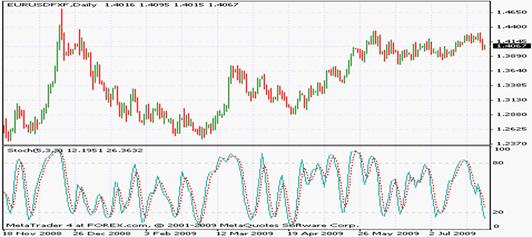
Stochastics Indicator
The stochastics indicator is
one of the oldest analytical tools in the market today. It was introduced in
the 50s by
On a chart, the stochastics indicator looks like this:
�
�
Note: Past performance is not indicative of future results.
In the above chart, the faster %K component is depicted in blue, while the slower %D component is shown in red. And now we'll discuss how to interpret and calculate these components.
Calculation of the Stochastics Indicator
The stochastics indicator is composed of two parts. The %K component is an oscialltor itself, and it is usually provided separately as the Williams Oscillator in most trading software packages. Let's first see how it is calculated, although we'll discuss it separately under its own heading.
%K = 100 x ( Recent Close - Lowest Low )/( Highest High- Lowest Low)
Here the highest high, the lowest low, indicate the values created during the entire timeframe on which the indicator is being applied.
The %K component tells us where the most recent range falls with respect to the maximum registered in the timeframe of our analysis. For example, if the most recent range is 50 pips, while the largest range is 100, the value of the component would be 100 x (50/100) = 50, which would mean that the latest range is in the 50 percentile of the maximum value in the analysis period.
The %D component is the 3-period MA of� %K. Both are plotted on the chart to help us derive signals. The MA can be a simple, or an exponential moving average depending on the desired degree of sensitivity to the latest market action.
The two types of slow and fast stochastics indicators both depend on the same principles, with the difference between them being that the slow stochastics indicator applies a longer period moving average to the %K component in order to smooth out crossovers and indicator volatility. The slow stochastics indicator is usually more reliable, although it emits a smaller number of trade signals.
Trading with Stochastics Indicator
The stochastics indicator is for the most part a range pattern indicator. It is used to determine overbought/oversold levels in a manner similar to the RSI. The oversold level is at 20, while the overbought level resides at 80. Although this is the most basic way of using this indicator, it is in fact rarely used because of the tendency to create false signals. Instead, as with most other oscilators, convergence/divergence patterns are sought between the price and the indicator, and then trading decisions are made sometimes supported by secondary concepts like the price extremes, or crossovers that can sometimes signal momentum changes.
Both for the fast and slow stochastics indicators, indicator crossovers are used to create trade signals on the basis of the movement of the %K component. The %K component is the faster moving of the two components, and when it rises above, or falls below the slower %D, a buy or sell signal will be generated.
Accessibility
Stochastics oscillator is available with just about any trading software in the market, since it is a part of the most basic technical analysis toolbox. All the major platforms provided by MGForex, Easy-Forex, ForexYard make this indicator available.
Conclusion
What is the best way of using the stochastics indicator? In a ranging marker, with a relatively calm trading environment, traders can use simple crossovers or overbought/oversold levels in formulating their trading strategies. In more complicated market conditions, it is probably the best choice to seek the divergence/convergence phenomenon, and to confirm with volatility indicators, or moving averages to pick only the most reliable configurations. You can, for example, choose a less volatile, ranging market as determined by the Bollinger Bands, or the ATR, for trading with the Stochastics indicator in trendless market conditions.
It is not a good idea to use the stochastics indicator in strongly trading markets, especially if you depend on overbought/oversold levels for trade decisions. Trending markets can be brutal in the way they breach these limits, and it simply is not worth the risk to try to test them with range indicators .
Ichomoku Kinko Hyo Indicator
Overview
The Ichimoku Kinko Hyo, Ichimoku Cloud, Equilibrium Chart was developed by Japanese newspaper writer Goichi Hosoda in 1968, and it is more familiar to futures and equity traders than to forex traders. In spite of its lacklustre popularity, however, the indicator is powerful, and innovative, worthy of greater attention than it receives currently in the trader community.
� 
Note: Past performance is not indicative of future results.
To understand how this indicator functions, we need to recall that the ichimoku cloud is a strategy more than an indicator. It combines two support/resistance levels to create a cloud, or reversal zone, and depends on the crossover of the tenkan and kijun sen to generate trade alerts. But since it is a strategy, it is not as versatile as some of the other, more basic tools like moving averages or the RSI. Thus it performs better in a more specific market type in which it is more effective as a strategy.
A typical trading scenario is generated when the red and blue lines generate a crossover, as observed on first and second vertical bars on the chart above. The purple and reddish dotted, areas, termed the cloud, or kumo, function as support/resistance levels where a possible reversal is indicated.
Let's a take deeper look at how the indicator is calculated.
Calculation
The Ichimoku Kinko Hyo indicator is calculated from four components with the following formulae:
1.����� Tenkan Sen: (Highest High + Lowest Low)/2 over 7-8 bars
2.����� Kijun Sen: (Highest High + Lowest Low)/2 over the past 22 bars
3.����� Senkou Span A: (Tenkou Sen + Kijun Sen)/2 plotted over 26 bars into the future
4.�� ���Senkou Span B: (Highest high + Lowest Low)/2 over the past 44 bars, plotted 22 bars ahead
Tenkan sen and kijun sen are essentially moving averages, and are used in a similar way with tenkan sen being the more sensitive of the two. The senkou span A and B are the main features of the ichimoku indicator separating it from an ordinary oscillator. These two values come together to create a cloud, or kumo, which is used a support or resistance level by traders depending on market conditions.
Usage of Ichimoku Kinkyo
In spite of the apparent of complexity, the Ichimoku cloud is very simple and easy to use once you get a grasp of how it works, and what it is. As we mentioned at the beginning, the indicator is more of a strategy than an indicator. It combines four separate tools into a single visual framework for trade decisions.
Trade signals are generated as the tenkan sen moves below or above the slower moving kijun sen, in a way very similar to the interaction of moving averages in the MACD, or the stochastics indicators. A bearish trend is indicated by the tenkan sen moving below the kijun sen, and vice versa. Once such a signal is generated, and we anticipate the development of a trend and open a position, the kumo (cloud) of the indicator comes into the picture. As mentioned elsewhere, the cloud is the support/resistance zone of the trade. In a bearish position, we expect that the price action will remain outside of the kumo most of the time, and if it remains in that region for too long, it may be time to reconsider or close the trade. Conversely, we will maintain our position for as long as the support/resistance zone established by the cloud holds. This makes 'letting profits run' a much easier task than it is with a simple crossover/ support/resistance strategy, since the problems created by volatility are handled better by the ichimoku cloud.
Take profit orders can be placed at any point outside of the cloud. Stop-loss orders should be placed in or at the edge of the cloud, and money management methods must always take into account the possibility of maximum losses being incurred as the cloud support fails.
Conclusion
There are a couple of conclusions that we can draw from our discussion of the indicator.
The Ichimoku cloud indicator is a complex tool that provides a lot of information when it is depicted on the chart. Two moving averages, and a layered support/resistance area makes the implementation of complex strategies a possibility, but also renders the addition of any extra moving averages, vertical Fibonacci levels, or arbitrary support/resistance data superfluous. Understanding the components of the indicator, and the rationale behind its usage will be helpful in avoiding noise on our charts. If we possess credible information about where order clusters are, it is not a good idea to utilize the ichimoku kinko hyo.
The kumo, or cloud component of the indicator is useful in conditions of high market volatility where strict adherence to single support/resistance levels on the chart may result in lots of false signals and small failed trades. By providing a zone, instead of a line, this indicator can be helpful in isolating more reliable signals from noise. We could easily construct a support/resistance zone with multiple Fibonacci indicators, or simple support/resistance lines, and decrease the number of generated signals by refusing to act on mere breaches of the outer and inner lines. The strength of the Ichimoku cloud against such a strategy is automation and speed. You have to depend on the same basic formulae in all market conditions, with little manual intervention,but at the same acquire greater flexibility in your decisions.
In conclusion, we can summarise the advantages of the Ichimoku cloud as concision, automation, and simplicity. Its disadvantages are a lack of customizability, and blanket coverage for lots of possible market configurations. If you think that the particular market situation is suitable for trading with two support/resistance lines, and two moving averages, the indicator is a perfect choice. If you conclude that other or more tools are necessary, it is a good idea not to take much time with the Ichimoku cloud.
Gator Oscillator
What is the Gator Oscillator?
The Gator oscillator is a forex
trading tool developed by Bill Williams. It is closely related to the similar
Alligator oscillator. As a trend indicator itd is most useful in markets that
display strong directional action. 
�
Note: Past performance is not indicative of future results.
On this chart, the upper section shows the price action, while the lower part is the Gator indicator. The smoothed moving averages that create the value of the bars are not depicted on the graph. As you can see, each bar of the indicator is comprised of a lower and an upper section the interaction of which determines the way the indicator is interpreted.
Calculation
The indicator is calculated according to the following formulae.
Median Price = (High + Low)/2
Jaw (lower moving average) = Smoothed moving average of the median price over 13-period
Teeth (upper moving average) = Smoothed moving average of median over 8-period
Lips (middle moving average) = Smoothed moving Average of the median over 5-period
These values, called balance lines, are calculated and shifted into the future by an amount specified by the trader. If the moving averages themselves are depicted on the charts, the jaw will be blue, the teeth will be in red, and the lips will be green most of the time. In our graph, the smoothed moving averages (i.e. balance lines) are not shown.
The bars seen below the centerline in the chart above show the absolute difference between the red line and the green line with a minus sign. The upper bars, on the other hand, depict the difference between the blue and the red lines. More concisely.
Top bar = Jaw - Teeth
Bottom bar = - (Absolute value of (Teeth - Lips))
The indicators is then evaluated on the basis of the emerging green or red patterns.
Usage
In order to interpret this indicator, we must define three states of the indicator bars.
Gator Awaking
Signifying the completion of a cycle, when the bars display different colors (any combination of red and green), the gator is 'awaking'.
Gator Eating
When both the bar below and the one above the centerline are green, the indicator is said to be eating.
Gator Satisfied
When, after an 'eating' phase, the one of the upper or lower bars around the centerline turn red, the Gator is said to be sated.
Gator Sleeping
When both bars above and below the centerline are red, the gator is sleeping.
The indicator is then interpreted on the basis of a hypothesis that each phase of the trend has a life cycle of its own, indicated by the awaking-eating-stopping-sleeping of the gator. When a phase of the trend is at its incipient stages, we will observe that the gator is waking, that is, one of the upper or lower bars will turn green. After that, as the trend accelerates and reaches its climax, we will note an increasing number of 'double greens' where both the upper and the lower bars are green. This is the eating phase. As the phase runs out of energy, and begins to slow down, one of the previously green bars will turn red, signalling that the gator is sated. And when both bars are red, the phase has ended, anticipating a new cycle.
Trading with this indicator is simple and easy. In general you open a position as the bars contract and show different colors; then maintain the position until both bars turn red, and exit to take profit. And alternative, more conservative way of using the oscillator is placing the take-profit order at the satisfaction phase. In this manner, while there is chance that some of the potential of the trade will be left unrealized, we are able to capitalize on the most violent phase of the mini trend with shorter time exposure to the market.
Conclusions
The main problem with this oscillator is its complicated nature. It is essentially a combination of three moving averages, and whether the addition of the graph at the bottom contributes much value, or merely complicates the picture will probably depend on your trading style. If you depend on moving averages in trading trends, the gator is a suitable tool for balancing and condensing your strategy. All the problems of trading with a moving average must be taken into account while a trader is making use of the Gator indicator. If you make use of other tools, such as the MACD, and do not favor simple moving averages, theGator may not provide a lot of additional value.
The main advantage of the Gator indicator is the compactness of its display. Instead of drawing three separate SMMAs on the chart, we have all the information provided by them packed into the bars below, which leaves enough space for the application of any number of additional indicators onto the price data.
We will conclude by repeating that the oscillator is suitable to trending markets. It is most harmonious with Fibonacci levels, or support/resistance lines due to its tendency to be volatile and unpredictable.
Developed by Donald Lambert and first made public in 1980, the commodity channel index is a well-known tool used by some commodity and forex traders for identifying secular moves, and trading them.
The CCI has a crossover line at zero, and an overbought level at 100, while values below -100 are regarded as signaling an oversold condition. The CCI is an oscillator.
�
Note: Past performance is not indicative of future results.
Here we see the indicator in action in the price chart above. It is interesting to note that the CCI gives many false signals even at extreme values. For example, the lowest value for our indicator, at -283.576 was recorded during a very minor, and passing bottom on the chart. As with most high sensitivity indicators using the ATR requires a lot of practice and patience in mastering it.
Calculation of the CCI
To understand how the CCI is calculated, we need to understand three different, yet simple mathematical concepts. The first is the typical price, otherwise known as the pivot point, which is the average (mean) of the high, low, and close for a trading period.
Pivot Point, Typical Price = H + L + C)/3
The mean absolute deviation (MAD) is the sum of the differences between the typical prices and their moving averages over the indicator's period divided by the same. So,
MAD(TP) = Sum of (TP-SMA(TP))/Indicator Period
The indicator is then calculated according to the formula below:
CCI = (TP- (SMA (TP)/ 0.015*MAD(TP))
Here what we do first is subtracting the simple moving average of the typical price from the typical price itself (TP-SMA(TP). If you've used moving averages, it's very easy to understand why this is being done. Remember, if the price is above the SMA, we usually interpret this as a sign that the trend is an upward one, although its momentum will be a matter of further analysis. Thus the first component (TP- (SMA (TP) determines the relationship of the price to its moving average - and also whether the indicator value is a negative or positive number. The denominator of the equation serves the purpose of comparing this difference to its historic average. Finally, the 0.015 factor is for amplifying the fluctuations in the indicator, so that the changes are easier to note visually.
So what we do is in fact just comparing the today's equivalent of the MAD with its historic value, thus gaining an indication of how extreme today's price is in the context of the past price action.
Trading with CCI
The CCI is used mainly as an overbought/oversold indicator similar to other indicators like the RSI. The overbought/oversold levels exists above 100, and below -100, respectively. Many traders prefer to focus on divergence/convergences between the price and the indicator with the purpose of reducing the number of trade signals, and avoiding whipsaws.
The CCI was designed for the commodity market, but any market where prices show a tendency to move in cycles will prove to be fertile ground for its use. The forex market, with its cycles dictated by interest policy, and the economic boom bust cycle, is a suitable field for the application of the CCI.
It is most important to remember that the CCI is a highly volatile indicator, and causes a lot of whipsaws. Traders need to be conservative about their risk management strategies when using it.
Accessibility
CCI is not as widely available as some other indicators of the same type, such as the stochastics or RSI indicators. MetaTrader, DealBook, TradeStation systems of major brokers do offer it, but due its lesser popularity among forex traders, it is a good idea to check beforehand with a demo account if it happens to be your favorite indicator.
Conclusion
CCI can be very useful with a few additional rules for validating its signals. As with the Williams Oscillator, you can choose to act on a signal only if it remains valid for a period of 10 days or so, leading to better, and more convincing overbought/oversold signals. Or you can combine the CCI with other indicators of different types for filtering out faulty signals. The key to using the CCI successfully is a careful approach to risk controls. It is volatile, so you should be prepared for unexpected outcomes and set your trading scenarios up in accordance.
Alligator Oscillator
Introduction
The Alligator oscillator is very similar to the Gator oscillator which we have examined previously in these pages. The difference between the two indicators lies almost entirely in the presentation of data. While the Gator oscillator presents any valid signals in a histogram below the price chart, the Alligator chart provides the oscillators in a raw form so as to enable wider and deeper analysis.
The Alligator oscillator, like the Gator oscillator, was developed by Bill Williams.
 �
�
Note: Past performance is not indicative of future results.
The chart looks very similar to a moving average chart, and that is what it is. The profitable phase of the market action is thought to exist between two contractions of the indicators. Every time the three components (jaw, teeth, lips) come together, and the mouth closes, an opportunity to open or close a position is presented. Trader lore states that the indicator emits correct signals about 30-50% of the time.
Calculation
The Alligator indicator is really a very simple tool once you understand what it is. Three smoothed moving averages plotted on a price chart and shifted by a few bars into the future create this indicator, and the slower and the less sensitive the moving average is to market action, the further into the future it is shifted.
Jaw, or the blue line, is the 13-period smoothed moving average shifted 8 bars into the future. It is also the slowest indicator.
Teeth, or the red line, is the 8-period smoothed moving average shifted 5 bars into the future.
Lips, or the black line (although it is commonly depicted in green by charting software), is the fastest 5-period smoothed moving average, moved 3 bars into the future.
As it us the case with the Gator oscillator, the interaction between these three SMMA's determines the trade signal.
Usage
This indicator is constructed on the notion that each trend, and its phases (or mini-trends), consist of waves that coincide with start, development, culmination and exhaustion, akin to the logic behind the Elliot Wave Theory. Similar to the Gator indicator, the four phases of the alligator's life must be identified.
Alligator Waking: When the green, or black line falls above or below the blue line, (or when the teeth rise above or below the jaw) after a period of contraction, the alligator is said to be waking up. This is the typical indication of a beginning phase for a trend.
Alligator Eating: At this phase the mini-trend is well-established, and we see the teeth breaching through the lips, and 'eating' signifying that the trend is soon to reach its climax.
Alligator Sated: We now see the teeth coming back or below the blue line, and the three lines beginning to contract to a smaller area, as the price action decelerates, and the trend has run its course.
Alligator sleeping: At this phase the smoothed moving averages come together, or in more colorful language, the mouth closes as the jaw, lips and teeth adhere to each other once again. This phase signals that the current trend has exhausted itself at least in its present configuration, and it is time to sit back and reevaluate the situation.
Conclusion
Let's recall what the alligator oscillator oscillator is. It is three smoothed moving averages drawn together on a chart and shifted to the left a little with the purpose of identifying profitable scenarios. As such, very little distinguishes it from a standard moving average strategy, and the differences that exist do not exceptionally favor this indicator.
The Alligator oscillator is most suitable to a trending market. It can be used in shorter timeframes in the context of an overarching range pattern, but it will surely generate many false signals in a ranging market. The best indicators to supplement it are support/resistance lines, or Fibonacci indicators to determine price targets if you happen to be beginner. Just keep in mind that trends are violent will easily invalidate any imaginary line on the charts, however strong it may appear.
If you wish to use moving averages in your trend analysis, make use of the alligator instead. Otherwise, the ichimoku cloud, also covered on this site, may be a better choice for greater clarity and depth of analysis.
Parabolic SAR Indicator
Parabolic SAR (Stop and Reverse) is an indicator developed by J. Willes Wilder to discover and exploit profitable trends in all kinds of markets. It is a popular tool among technical traders, and a straightforward and as a simple mechanism for analyzing the markets, it offers some unique advantages over other tools.
Below we have a chart of the EURUSD pair depicting the Parabolic SAR in action. We observe that the indicator was able to capture many small reversals with remarkable accuracy. And in those cases where it failed, we see that the thrust of the market action was strong enough to place it into a correct configuration, thereby minimizing the potential losses of a faulty trade.
Calculation of the Parabolic SAR
Parabolic SAR is calculated by a recursive formula which ties the prices of one period to another through simple arithmetics.
SAR of Today = SAR of Yesterday + a (EP- SAR of Yesterday)
Or
SAR of Tomorrow = SAR of Today + a(EP-SAR of Today)
EP is the maximum recorded during the time period in consideration. If during each period of analysis a new record is broken, the EP will be updated accordingly, and the SAR value will change.
"a" represents the acceleration factor. It is set at 0.02 in the beginning, and reset each time a new EP is achieved. This is to ensure that the indicator's value will come closer to the EP value every time a new record is broken, but the maximum value for the EP is usually set at 0.2 in order to prevent it from becoming too large and distorting the analytical picture. Due to the higher volatility of the forex market, traders prefer to give an initial value of 0.01 to the acceleration factor on the basis that frequent fluctuations, leaps and bounces in the price action do not justify attaching a lot of significance to arbitrary price highs.
Once the SAR value is calculated one of two courses will be taken in order to derive the signal from the indicator. If tomorrow's SAR remains within today's or yesterday's price range, the indicator is set at the lowest price during that time period. For example, if the SAR is slightly above yesterday's opening lowest price, or close to, but below, yesterday's high, the indicator will be set at today's lowest price.
If on the other hand, tomorrow's SAR value is within tomorrow's price range, the indicator will switch sides. If it is below the price action, it will move to the upside, and if it was on the upside it will come below, signifying a trend switch.
Trading with Parabolic SAR
Parabolic SAR is generally regarded as a trend indicator, since other types of markets tend to generate false signals leading to whipsaws and fake breakouts. The best way of trading the Parabolic SAR is to first gauge the direction of the market by using simple tools like trend lines, moving averages, or tools like the average true range, before using Parabolic SAR to trade the shorter-term fluctuations that can be exploited within a longer term framework.
When it is drawn on a chart, the Parabolic SAR will indicate a bullish market if it remains below the price, or supports it, and when it is above the same it is regarded to be suppressing the prices, indicating bearish conditions. Not only is it possible to regard this phenomenon as a signal for the opening of a position, but it also makes sense to use the Parabolic SAR as a stop or take profit level in each trade. For instance, when the price action is bearish, and we have a sell order, one can choose to exit the position when the price action approaches the SAR level by a predetermined number of pips. When the market action is bullish on the other hand, we can use the Parabolic SAR as a support level, and when the price gets too close to it, we can liquidate the trade. It is also possible to use a time-stop while trading with this indicator. In this case, there is no necessity of a market reversal. Instead we determine a timeframe during which the trade will be kept active, but when that period is out, we'll liquidate it even if the Parabolic SAR indicator is indicating positive conditions. This course of action is justified on the basis that in a strongly trending market where this indicator is most useful, lack of progress can be a sign of approaching reversal.
Conclusion
This indicator is most useful in a trending market. It is best to use it in combination with other indicators that establish the general direction of the trend at a higher level, while trading short-term volatility with the SAR. The advantages of this technical tool are its simplicity, clarity of signals, ease of interpretation, and tendency to generate concrete points of action during a trending market. These same strengths are also the weaknesses of the indicator. It is sometimes the case that the solid signals of the SAR indicator lack any practical basis. To avoid such conditions, we suggest that you use the SAR indicator with oscillators that signal emerging divergence/convergence scenarios, so that the common problem of whipsaws are reduced in frequency. Ultimately, of course, our best guide should always be money management and prudence in trading, beyond any single technical indicator
Elliott Wave Theory
Elliott Wave Theory is a popular method of analysis that applies a technical approach with a fundamental analysis interpretation. Elliott Wave Theorists also concentrate on the price action strictly, and agree to the notion that the price is the beginning and end of all analysis, but they recognize that there exists an important relationship between liquidity, credit, and economic robustness which underlies the existing price patterns in the market.
The Wave Theory was first proposed by Ralph Nelson Elliott, an accountant, in the 1930s. Elliott's approach was condensed into its definitive form in his 1938 book� "Nature's Laws - The Secret of the Universe" in 1946. Since then, the theory has been regarded both as pseudo-science, and as an effective method for dealing with the uncertainties of the market. Academics tend to disregard it in general, while some famous trading personalities, such as Robert Prechter, and Paul Tudor Jones claim to have attained success by using it.
Calculation
The Elliott Wave Theory is based on the cyclical nature of market events. Most traders are familiar with the fact that market events, and economical conditions tend to recur in time with a varying frequency. A growth phase may be exceptionally long, or a recession (and a bear market may surprised to be exceptionally harsh and deep, but the nature of trading and economic activity ensures that sooner or later the existing conditions will revert to the opposite, and the market
Trading with the Elliott Wave
A wave theorist will divide the price pattern into several sub-patterns� and consider trade opportunities on the basis of trends that exist at lower levels. Although Elliott Wave Theory is often discussed in the context of decades or years, the fractal nature of the price action enables the application of the theory at any timeframe.
Wave theory divides price action into five main phases. At the first phase, the trend is barely obvious as only a small number of traders are aware of its emerging potential. At phase two, there is a small correction, but it never brings prices below the inception point of the trend. Phase three is the strongest and most powerful, and also drives a large number of bystanders into the price action. Phase four is the ensuing corrective phase, and phase five is the final, bubbling phase of the trend where everyone is bullish and massive amounts of capital enter the market. Phase five is followed by a collapse which ends the trend.
Deciding where each of these phases begins or ends is mostly a matter of intuition. As such, there are no generally accepted methods, and each trader will sooner or later improvise his own techniques for determining the time frame of a trend. This is not necessarily a problem, since the best way of coping with the resultant failures and losses is choosing a strategy that will accommodate your risk tolerance and mental resilience in trading. Since each person is different, interpretation of Wave Theory also varies from person to person.
Conclusion
�Advantages
The main advantage of the Elliott Wave Theory lies in the organization and compactness that it grants to the chaotic and price action. By reorganizing the market patterns into an easily understood hierarchy, the Wave Theory allows greater precision in trade decisions, increasing the trader's confidence, and widens his horizon by stretching the field beyond the randomness of short-term market events. All these make it possible to formulate more sophisticated and advanced strategies in trading while still keeping the necessities and implications of the immediate market action in mind.
�Disadvantages
The weakness of the Elliott Wave Theory is its arbitrariness. It is rare to have two analysts examine the same chart part pattern and reach the same conclusions or draw the same wave patterns as a result. Indeed, it is almost possible to imagine a complex price pattern on which a large number of analysts will reach consensus.
The main reason of this problem is the intuitive, fluid formulation of the theory itself. By attempting to place market dynamics into the strict formalism of a deterministic theory, the analyst deprives himself of the benefit of the insight that prices will and often do move for reasons which do not in any way accept explanation by referencing the past. In other words, it is possible that the market will create recurring patterns that appear to be cyclical without any simplistic underlying causality based on patterns and visual analysis. And when the wave theorists try to disregard this fact and confine the price into an arbitrary structure devised on very strict rules, the outcome is a rainbow pattern of scenarios that have little relationship to actual market dynamics, or the realized future market trends.
In summary, we can say that the Wave Theory is useful as a tool for organizing one's opinion about the markets, but it has very little predictive power in the storm of real market action. One could certainly use the theory to generate entry/exit points for trades, but success is only possible if the notion of precision is discarded, and the data is evaluated with strategies suitable to a chance game.
Fibonacci Series and Forex: The Power of Nature
The Fibonacci series is the
infinite sequence of numbers (0, 1, 1, 2, 3, 5, 8, 13 ..)
in which each item is the sum of the preceding two. For
example, 2= 1+1, 5 = 3+2, and so on. This sequence has been recognized
and examined in
It should not be that surprising that the series, as commonly encountered in many natural processes and patterns, is also useful in the study of the price action and the markets. We concern ourselves with the forex trading aspect of indicators: the way in which the market action seems to follow certain suggestions of the Fibonacci Series when it is applied to various trends and range patterns.
The Golden Ratio
Many traders use the Fibonacci Series for trading decisions, but most of time, the raw numbers themselves find little use. Instead, to make analysis easier, traders use the ratios between the numbers in the Fibonacci Series to determine various factors like retracement levels, extensions of trends, and resistance levels inside a price range. All these ratios are essentially derived from the Golden Ratio which is the limit of the ratio of two successive numbers in the Fibonacci Series. For example, 5/8 is approximately 0.62. while 8/13 is approximately 0.61. If we subtract this number from one, we get 0.38, which is also the ratio of two numbers in the series with one number in between. For example, 3/8 is equal to 0.375, while 5/13 is approximately 0.38. The ratio between Fibonacci numbers converges on ideal values as the series progresses.
To summarize, in the infinite series
0, 0, 1, 1, 2, 3, 5, 8, 13 ..
8/13 = 5/8 = 3/5 =2/3 = 0.61 with the equality being an approximation, and the ratio approaching the ideal Golden Ratio (0.6180339887) as the series progresses.
1/3=2/5=3/8=5/13 = 0.38. Similar to the above, this ratio is simply the subtraction of the Golden Ratio from one.
Overview of Fibonacci Indicators
So how are the Fibonacci numbers (rather the ratios) used in technical analysis, and forex? It has been observed countless times in the market that the resistance support levels in the context of a developing range or trend pattern are determined by the Fibonacci ratios. So for example, if the first leg of a trend has the length of 3x, the retracement is expected to be 0.38*3x, or 0.61*3x. Similarly, the extension of the trend will be at 5x, or 8x, as we would expect in the series. (Remember that the series runs (...3,5,8...)). All Fibonacci indicators are built on this principle. Let's see a few examples
Fibonacci Retracement
This indicator is used for determining retracement levels in an ongoing trend. The two most important ratios are 0.38, and 0.61, but 0.50 is also used. When using this indicator, the trader simply notes the levels that correspond to the multiplication of the size of the main price movement with the ratios, and notes them as potential support levels. For example, if the price moved from 1 to 1,3 in its main leg, the retracement levels would be at (0.3*0.61= 0.183) and (0.3*0.38=0.11), that is, at 1.18, and 1.11. Here 0.3 is (1.3-1), that's the length of the main movement, and the factors are the Fibonacci Ratios.
Fibonacci Extension
Fibonacci Extension serves the same purpose, and is calculated in the same manner as the previous item, only it is used to calculate extension levels, the resistance levels where the trend may reverse after an initial leg. For example, in our previous example, to calculate the next possible leg of the trend (and the resistance level) we need to multiply the length of the first leg at 0.3 with the Fibonacci Ratios of 1.38 and 1.61.
Fibonacci Time Series
The Fibonacci Time Series is the Fibonacci Series applied to the timeframe of trading. Thus, we first choose a developed pattern from the past, preferably at the beginning of some long term trend. For example, we pick a head and shoulders pattern which is the first leg of a long term uptrend, and apply the time series to it. If the H&S pattern developed over a period of 2x days, we expect the subsequent triangle to develop over a period of 3x days, and the correction after that to last 5x days with the number picked up from the sequence discussed above (0, 1, 1, 2, 3, 5, 8, 13 ..). The principle is that each complete phase of the trend should develop in a time period determined by the Fibonacci Sequence.
Conclusion
The trading software will do all of the calculations above and provide them for you without you having to crunch a single number. So don't be discouraged if you find the topic a bit too complicated. It is very easy to get the hang of this subject after drawing a couple of Fibonacci levels on a forex chart.
Fibonacci Series is a mathematical concept, but since the market action is a chaotic process, it would not be sensible to expect the prognostications based on this series to be correct at all times. However, it is very useful in determining potential reversal, or reaction points, as well as points where we can leave or join a trend, based on the Fibonacci Ratios. It is easy to use the Fibonacci Indicators, and they are very popular among traders of all experience levels. As long as you don't regard them as infallible, they will be very useful in your trading decisions.
�
�
Demarker Indicators
The Demarker indicator is named after Tom Demarker who claims to have developed this indicator to overcome the shortcomings of other overbought/oversold oscillators. There are different versions of it� in the market; in some cases the indicator uses 0 and 1 as the maximum and minimum of oscillation, while in others the typical 0-100 range is preferred.
Any level between 3 and 7 (or 30 and 70 if bigger numbers are preferred) is regarded as a neutral level characterizing a continuation phase. If the price is in an uptrend, and the indicator value is also rising, the trend is expected to go on. If we observe an uptrend, while the indicator value is falling, we're faced with a divergence, implying that the uptrend is slowly losing momentum and may suffer an abrupt reversal. Similarly, when the price is in a downtrend, but the indicator's value is rising, we suspect that the downtrends is weak. The oscillator and price action are converging, implying an ultimate reversal. If both the indicator and the price are in an uptrend, the interpretation is that the existing price pattern will continue to develop.
�
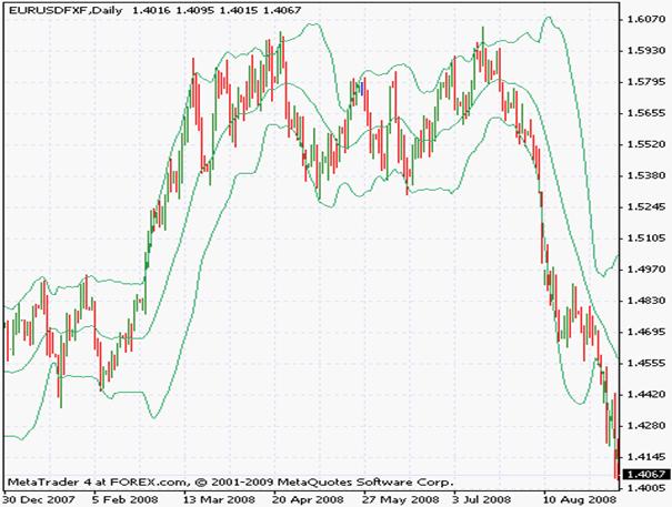
Bollinger Bands: The Best Volatility Gauge for the Intraday Trader
Introduction
One of the more common technical tools used by traders, the Bollinger Bands were created by John Bollinger in the early 80s. The tool was not intended as a technical analysis item for trading decisions, but its perceived utility for that purpose has made it widely popular in the ensuing decades. It is likely to be a part of any useful trading software, and is utilized both independently, and also as part of a general trading strategy by countless traders all over the world.
�
Note: Past performance is not indicative of future results.
Here we see a typical day's price action analyzed with the Bollinger Bands. We observe the contraction of the bands in the middle part of the chart, and on the left- hand side. In between, we observe the bands expanding as the violent up- and downward movements create great momentum in the market. The upper and lower lines are the standard deviations to be discussed below soon, while the middle line is the moving average often used as the signal line by traders.
Calculation of the Bands
The Bollinger Band consists of a moving average, and two standard deviation indicators superimposed on it. The standard deviation is used to determine how much the price diverges from the mean (i.e. how great the momentum is)� for the ongoing market movement. Interested readers can refer to the related article on this website, but typically, the standard deviation will move away from the moving average in the middle when the price moves up or down with strong momentum.
More concisely, the Bands consist of
an N-period SMA, EMA, or smoothed moving average in the middle, depending on the choice
the upper Bollinger Band, which is an N-period standard deviation multiplied with a factor K, and added to the SMA value
the lower Bolliner Band, which is the same, but the standard deviation is subtracted from the SMA.
N and K can be determined by the trader. Typical values are 20 for N (the SMA and standard deviation period), and 2 for K. The K factor is used to make bands pronounced and easily observed.
Trading with the Bollinger Bands
There are many different ways of interpreting the bands. At its simplest form, (and also as advocated by its creator, Professor Bollinger) the bands are used to measure volatility. They expand when volatility is rising, and contract when it is falling. The bands are a good gauge of volatility with very easily identifiable visual patterns emerging as the market progresses through various phases. In addition, over the years traders have also improvised many different ways of using this indicator for trading decisions. One way is to buy or sell when the price action crosses the upper or lower band, respectively, anticipating a breakout, or a rapid movement of the price. Trades are closed when the price returns to the moving average in the middle. Another way to use this indicator is anticipating a reversal after long periods of low or high volatility. For example, a trader will enter a buy order in an uptrend after the bands remain close together for a long while, anticipating the next leg of the trend to commence soon. There are also many composite strategies using the Bands for anything from confirmation to signal generation for an incipient price phenomenon.
Accessability
Just about any trading platform will come equipped with the Bollinger Bands since it is so popular among traders. The MetaTrader 4 platform, DealBook of GFT Forex, FXCM Trade Station all provide this indicator, as well countless others not mentioned in this article.
Conclusion
Bollinger Bands serve two purposes. They depict market volatility in an easily identifiable form, and they also help us in trading decisions. The creator of the indicator does not claim that the Bands predict anything about future price action, but that doesn't prevent the indicator being very popular in that role. It is, of course, up to you to decide in which way you'll be using the Bands

�
�
Note: Past performance is not indicative of future results.
The lower section of the chart demonstrates the Demarker indicator in action. As the price fails to break through 1.4575 level, the indicator fluctuates against the neutral 0.5 level, confirming the indecision of traders. Later, however, the indicator crosses below the 0.5 level decisively, as observed on the chart, confirming the downtrend, and reaching a level very close to zero before finally reversing and approaching the signal line at 0.3. In spite of the developing divergence, price action remains conclusive however, as MA line remains safe, and no actionable, clear signal can be derived at this stage. We give this example to remind the reader once more that it is safe and prudent to avoid taking any position when clear signals backing it are lacking.
Calculation of the Indicator
The Demarker indicator is calculated by first determining a DeMin, and DeMax value, which roughly correspond to the high or low of a particular time period. The obtained values are then plugged into a formula which generates the value of the indicator itself.
If the high of today is greater than the high of yesterday, we set the DeMin value at the difference of highs of the two time periods (High of today - high of yesterday). Otherwise, DeMax is set to zero. Similarly, if the low of today is lower than the low of yesterday, the difference between the lows of the two periods becomes the value of DeMin (low of today- low of yesterday). If the low of yesterday is equal or lower than today's low, DeMin is set to zero.
Now we plug these two values into the formula below:
DeMark = N-period Moving Average of� DeMax / (N-period Moving Average of� DeMax + N-period Moving Average of DeMin)
Here the moving average can be of any type, but most software packages use the simple moving average for calculation.
Taking a look at this formula, we observe that the value of the indicator will rise when the higher DeMax values are registered (in other words, market records higher highs on), and it will fall when the moving average of the lows attains higher values.
Trading with the Demarker Indicator
DeMarker Indicator is an oscillator, and it is possible to use with it all the common techniques that are applied to oscillators. The oversold and oversold levels of the indicator are at 0.3, and 0.7, respectively. When the oversold value is exceeded, the expectation is that the prices may soon stop falling. In the opposite case, we anticipate that the uptrend will run out of steam in a short time.
If you remember how the RSI is constructed, you will note that the formulation of the demarker indicator is almost the same as that of the RSI with the difference being that the RSI most often uses an exponential moving average, while the demarker indicator uses the simple moving average of the prices. But on the whole, both indicators compute the same formulae for the min-max values, and interpret them in very similar ways.
In short, it is fair to say that one will never need to create technical strategy where both the Demarker and RSI indicators are necessary. They are both oscillators, but beyond that, the great similarity between the two indicators means that using one will always grant us all the information that can be derived from the other.
The indicator is most suitable to a ranging market. If it is used in trending markets, it must be used as an auxiliary to a trend indicator, and divergence/convergence configurations must be sought out for its interpretation.
Conclusion
The Demarker indicator is a solid, simple and reliable oscillator in general, and can be used as a substitute for the RSI when the trader chooses to do so. It doesn't possess any great qualities distinguishing it from the latter, however, so there is no point in creating a combination of the two in just about any conceivable scenario. Arguably, the decision to use any of these two indicators will depend on availability. It is a good idea to use one when it is available and not to worry too much about the other
�
The ATR is an attempt at finding out about trader sentiment by comparing price ranges over a period of time. To do this in an easily understood and observed manner, the range values are presented in the form of an exponential moving average.
�
Note: Past performance is not indicative of future results.
As we see, the ATR looks more like an oscillator than a moving average. This because of the fact that although prices do not have bounds (they can move as high or low as the market can take them), the actual trading range is in fact confined to practical limits during even the most heated action in the market. By making use of this knowledge J. Welles Wilder was able to create an exceptionally simple, yet powerful and tradeable indicator.
Calculation of the ATR
The average true range indicator is in some ways similar to the commodity channel index discussed in this site. Here also, we compare price ranges with previous values to establish overbought oversold levels. But unlike the CCI, the ATR itself is a moving average: namely, it is the exponential average of a concept called the "true range" over a trader-determined period. Let's examine how it is calculated in greater detail.
Let's first define a few concepts used in the determination of the true range:
The range is the value (H - L) where H is the high, while l is the low of the price over the period.
The true range is the extension of this concept to the period prior to the one in consideration. It is defined as Max(high, close) - Min (low, open) of the previous period, if the price action extended beyond today's range in that timeframe. In plainer terms, the true range is the largest distance between the high or close, and low or open of a time period. It is an attempt to discover the greatest extent that the price action covered, thus establishing how agitated traders were.
The
Trading with ATR
There are two ways of using the ATR. One is looking for divergence/convergence patterns between the price action and the indicator values. If the range is contracting even as the market is breaking new records, we would consider the possibility that traders are losing confidence in the momentum of the market. Otherwise, successive highs would result in greater ranges as more and more traders are excited about the price action. Another way of utilizing this indicator is looking for trends in the daily ranges, and entering or exiting positions in anticipation of breakouts. If the EMA is showing pattern of increasing ranges while the price action itself is muted, there is signal that a consolidation formation will culminate in a breakout one way or the other.
As with the CCI, and the Williams Oscillators, the ATR is a volatile indicator. If you plan to use it in your trade decisions, it is a good idea to complement your trading strategy with strong risk controls so that the whipsaws that materialize, like those observed in the chart, do not lead to unacceptably high losses.
Finally, it is very important to understand that the ATR does not say much about price direction, or trend duration. It measures the volatility of the price action, and is useful for analyzing extremes of positioning, both in trends, and range patterns. For analyzing direction and duration, we should use other indicators derived for this purpose.
Accessibility
ATR is not one of the most popular indicators out there, but it is regarded as a part of the standard toolbox of any trader, beginner, or professional. It comes as a part of the Easy-Forex trading software, the MetaTrader platform, as well the trading packages of MGForex, or ForexClub. Some minimalist designs may not include it, so it is a good idea to check before you make a decision about your account.
Conclusion
The ATR indicator is a powerful tool for volatility based strategies. Although prone to generating whipsaws, its role as a volatility indicator means that you can determine the type of market that you wish to trade with the ATR, while deriving actual signals and entering trades on the basis of other secondary strategies. Most of us have a good idea on how important volatility is in determining the profit potential, and suitability of a particular market environment for our trading decisions. The ATR, along with the Bollinger Bands, is an exceptional way of measuring this aspect of the market, and offers great potential to those who seek to use it.
MACD Indicator
One of the most popular and common indicators used by forex traders today, the MACD is a trend indicator used to gauge the strength and direction of an ongoing trend. Developed in the 60s by Gerald Appel, MACD is a simple, and straightforward tool easy to grasp and use. The MACD is only useful in trending markets, and its use in ranging market conditions is in general discouraged. This is because the EMAs are highly price sensitive, and may generate false signals in the context of the lower directional momentum of a range pattern.
Calculation of the MACD
The MACD is composed of two exponential moving averages (EMAs), and a signal line. The calculation of an exponential moving average can be found in the relevant article.
The formula of the MACD is
MACD = EMA(12) - EMA(26)
with the numbers indicating the period of the indicators. Also, the histogram is calculated according to the formula:
Histogram = MACD - EMA(9).
Now let's examine the formulae to get an understanding of what the MACD is really showing us when it is drawn by the charting software. We know that an exponential moving average is a sensitive moving average emphasizing the latest period of the market action. The reader can consult the related article on this site, but in short, the EMA is used to identify the momentum of the price action, and to identify changes in direction or power at an earlier stage, compared to the SMA. The MACD goes one step further and lets us compare a short term EMA with a longer term one, and thus adds a second dimension to our evaluation of the price action. In essence, when the EMA(12) rises or falls above the EMA(26), the indication is that an emerging new trend is gathering momentum, and a new position is feasible.
The histogram can be thought of as the third and final dimension of our evaluation of the price action. Here, we compare the value of the MACD itself to the control signal of a much slower EMA(9). This EMA can of course measure 9 days, hours, or months. The resultant histogram value and the MACD value itself are used in many different ways by analysts and traders.
� 
Note: Past performance is not indicative of future results.
Here the gray bars in the lower section constitute the histogram. The dotted red line is the MACD itself. The line around which the histogram fluctuates is the zero-line. Apart from the obvious relationship between the tops and bottoms in the market, and the MACD's extremes, we observe a very powerful and successful trading signal developing in a bullish convergence as indicated by the green lines on the chart. Even as the price continues to make lower lows, the MACD is making higher highs, culminating in a powerful bullish reversal later.
This graph does not show the signal line of EMA(9), but it is not necessary, because any crossover is already being showed on the histogram. The histogram changing sign (becoming negative while positive, and vice versa) indicates that a signal line crossover has occurred.
Trading with MACD
The MACD is popular, as we mentioned, so there are many different ways of using and interpreting it popular among traders today.
1.�������� MACD crossover
An MACD crossover occurs when the value of the indicator changes sign. In other words, the MACD line crosses above or below to centerline, which is the zero line on the chart above This is often thought to indicate a momentum change, that a bullish or bearish momentum is being created in the market. Another crossover occurs when the MACD crosses its signal line, that is, the EMA(9) we discussed before.� Crossovers are numerous, however, and create lots of false signals, so either use them with conservative money management methods, or confirm them with signals from other tools.
1.�������� Divergence/convergence patterns
A majority of traders look for this sign exclusively when depending on the MACD indicator. A divergence/convergence indicates that the price trend is soon to run out of steam. The reversal does not depend on the nature of the trend. A down or uptrend may both experience a reversal following the appearance of a divergence/convergence pattern on the oscillator and the price.
Accessibility
Name any trading software, and it is more than likely that MACD is offered by it. It is simply so ubiquitous as a tool of technical analysis that it is highly unlikely to find a charting package not providing this indicator. The popular MetaTrader 4 platform, eToro are some examples from a large list that could be assembled with ease.
Conclusion
MACD sometimes emits false signals due to the tendency of EMAs to see trends where none exist. The price sensitive nature of this indicator makes it somewhat less reliable and a bit more prone to errors than the typical indicator. Hence comes the criticism of it often encountered at websites and forums. But that, of course, does not mean that it is exceptionally weak, or that it is not a valuable addition to a trading strategy. The key is knowing that no indicator is infallible. Only by coupling our knowledge of the indicator with a good understanding of money management strategies can we expect to be a profitable over the long term, otherwise, a bare dependency on indicators will not generate the prosperous results anticipated.